
Last Updated on June 19, 2018
Weekly Design Inspiration – Superhero Logos
Each week we bring you a collection of inspirational and interesting work from the world of graphic design, photography, art and more. Inspiration can be found everywhere and we hope these articles combined with your Photoshop skills will fill you with creative spirit and ideas for your own work. In this article, we take a look at four recognisable superhero logos.
Super Hero Embodied. The Logo. Clean Simple Bold.
Though not the first superhero character, Superman has, through popular support and intense marketing, been elevated to the grandiose heights of superhero legend status. Accompanying this, and in essence, driving this meteoric rise was the introduction of ‘Merchandizing’, specifically the registering of the Logo emblazoned across his muscular torso as a registered Trademark in 1945. Over its almost 80 year history, the original Logo has undergone many minor alterations, whilst never deviating from its fundamental characteristics, Clean Simple Bold. In this article, we will examine this core principle and how to apply it to your own work for whatever logo you need to create.
Superman Logo
In its simplest form, the logo is simply a stylized ‘S’, the dominant letter character of the Superhero name, in an inverted pentagon border (this provides perimeter symmetry on the Y-Plane). The border and ‘S’ symbol merge to create a new emboldened emblem, distinct but still recognisable as its constituent elements. The distinction is further highlighted by the addition of a primary colour palette. The emblem’s inner borders or islands blaze bright yellow in contrast to the rich and strong red of the character-border, this heraldic crest-like logo is then further accentuated by presenting it floating above a deep blue backdrop (and muscular physique). The clean perimeter of the pentagon resembles a cut diamond, the hardest know substance at the time, suggesting strength, resilience, permanence and security, idealized masculine traits and the simple primary colours allow the emblem to stand out.
Bright primary colours reflect or re-enforce a positive ‘Good-Guy’ Superhero while dark and subdued palettes convey that darker side or Anti-Hero. There are no eye-traps capturing your focus to a particular flourish, you simply perceive the logo as a whole and complete entity onto itself and this, in turn, comes to symbolize and embody the characteristics of the Superhero. Variants have surfaced over time with highlighted borders, alternate colour schemes, embossing or other post design additions but the Clean Simple Bold principle stands the test of time.
Wonder Woman Logo
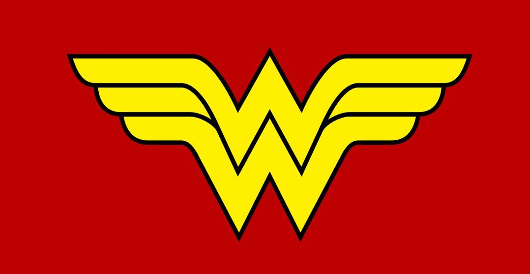
The Wonder Woman logo has morphed a number of times over the years (even the experts get it wrong sometimes). In its original 1942 incarnation, the logo was simply a Gold eagle set against a red backdrop. The relatively high-frequency use of eagles in other logos prevented it’s registration as a Registered trademark so Milton Glaser stepped in to clean it up.
The result was that the Wonder Woman logo capitalized on the intrinsic dominant letter characters of the superhero name, highlighting the two ‘W’s and merging them with the suggestion of protruding feathers, tipping the hat to the original eagle.
In looking at the logo we see Clean symmetrical boundaries, the two W’s sitting in a vertical offset with the tips extending symmetrically to emulate a feathered wing. When combined with the Simple gold over red palette produce a crisp Bold emblem. Again the bright colour palette is used to reflect and re-enforce a positive ‘good-girl’ character.
Punisher Logo
Frank Castle, a.k.a. The Punisher. The dichotomy. Light and Dark. Good and Evil. The Punisher logo has taken on a life of its own with veterans groups and the US Navy seals unofficially claiming this iconic logo as being symbolic of their own endeavours. Unlike the two previous examples, this logo does not use a letter character in the logo. This design uses a pure white jawless human skull with three extended and exaggerated front teeth set above a Black background. The simple black Eye-sockets and nasal cavity give sufficient detailing to the emblem that nothing else is required or warranted (know when to stop – less is more!)
The emblem is inherently symmetrical vertically. Here we see the intense contrast of a sinister white icon on a black background projecting the emblem forward in a bold statement, ‘Behold, death is upon you’, the dark palette background helps paint the darker side and the high contrast projects its impact. Again mastery is demonstrated through a Clean Simple Bold design.
X-Men Logo
There is a multitude of characters, both male and female, in this dynamic line up of super-charged beings, all sharing the same group logo. This logo, as with some of the previous ones, uses the existing dominant letter character to anchor the logo and, in a similar fashion to the Superman logo, is merged with a geometrically symmetrical boundary to create a new self-contained emblem.
The emblem is then brought to life with a brushed stainless steel style colour reflecting a white illumination source. The interior islands of the emblem are contrasted by a dark grey to black background and are then highlighted further by a narrow white bounding perimeter bringing an added depth of field to this crisp logo.
What can you take away from these famous logos to use in creating your own designs?
Clean – Know when to stop. With logos, less is more. Instant recognition. Minute detail dirty’s the Logo. Think – Can I print this on a tee shirt? High art versions may flourish later, but a Clean Simple Bold logo will be required to launch them.
Simple – This is a combination of rational reduction and artistic expression. Reduce the primary concept to it’s simplest form (think cave art – simple symbols and colours) or extract the entity’s Dominant letter character as a base to create from. This is your logo’s anchor point and focal point. Avoid excessive detail and fine lines. A boundary or perimeter shape may help bring symmetry to an awkward anchor point or it may be used to give depth of field by floating the emblem above the bounding shape. Emblems with a non symmetrical perimeter or boundary may be confusing to look at, may be difficult to remember and are generally considered ‘un-cout’. Where possible, the perimeter or boundary should be symmetrical across either the X-Plane or the Y-Plane (shapes with odd-number of sides) or both (shapes with even-number of sides). You still recognise a well balanced logo, even if only seeing it’s reflection in a mirror.
Bold – A clean simple logo will go un-noticed without BOLD definition. This is creative expression. How do I make this emblem pop? Colours and Contrast. Use bright colours for the good-hero brighter side and dark colours for the anti-hero dark side. Contrast either separates or blends. Island boundaries create contrast by breaking the transition from foreground to background. Colour gradients within the Logo may add more complexity than required which may fail if the logo is transferred to fabric.
I hope you found this article useful. Please use the share buttons to share it with your friends. Thank you!

Superhero Logos are so much fun. As a huge Marvel fan and as a designer, I really enjoyed reading the article. The points are absolutely right, Super hero logos should be Clean, Simple and Bold, something that could be printed on a t-shirt.