Design Inspiration: 9 Best-Selling World Beer Labels
Have you ever bought a bottle of beer you haven’t tasted before, just because you like the look of the label? In today’s design inspiration post, we’re looking at the design of beer labels of some of the top-selling beers from around the world. If you’re new to design, why not take a couple of minutes to look at some of the subtle and not so subtle design elements that make up the label design of your favourite brew.
Designer Know Thyself (And Thine Target Audience)
No matter who you are creating a design for, whether for a beer label, a poster or a logo design, you need to keep at the forefront of your mind:
What is your product?
Who is your customer?
How do these customers buy the product?
By asking, and answering these questions, the designer of the beer label, can focus on creating an appropriate, interesting, maybe even surprising design. The primary focus is on differentiating your product from the competition and making a connection with the customer.
The Promise
In encapsulating the product in a design presentation you are committing to delivering a promise to the consumer, ‘This is your beer’.Good presentation removes hurdles on the path to product acceptance. Making promises and keeping them is the best way to build a Brand. The work of the designer is one part of the overall building of a brand.
Let’s take a look at some label designs of established beer brands
Tsingtao Beer
Tsingtao Beer Label
The company name and flagship product is Tsingtao Beer. The label for the beer is shaped more like two separated hemisphere’s than an oval, giving it a stouter than slender appearance. The area between the hemispheres is dominated by the Brand/product name in a capitalized and raised heritage font. The shadow from the raised font brings definition and strength to the subtle gold border of the white font in the brand name.
A strong rich red backdrop contrasts regally against the brand name giving it a distinguished appearance. A thick gold band forms a distinct but soft border around the label periphery and also creates a focal point around the brand/product name. Within this gold border, a second rich band of red breaks it’s parent and discreetly houses some wheat sheaf motifs, the establishment date and the brewery information.
Centred in the upper hemisphere, a white temple on an island in a lake, a hazy sun shining down on a sea-to-sky blue gradient. This emblem embodies the purity of intent in the white temple and the purity of the ingredients as it captures the fire of the sun, the dynamic nature of the air, the freshness of the water and fertility of the earth. This icon is bordered in a similar fashion to the outer label border and is again softly broken by the wheat sheaf motifs.
The lower hemisphere holds the brand/product name in a strong, raised traditional Chinese font, floating above a rich forest green or heritage green backdrop and directly below that an intricate and detailed emblem in fine white lines brings perfect closure to this label.
A beautiful design with deep symbolism and clear messaging, an excellent use of heritage elements in a clean a modern incarnation of an established label.
Budweiser Beer
Established in 1852, as the Bavarian Brewery and eventually becoming Anheuser-Busch Brewing Association in 1879. Structurally, the Budweiser Label has maintained its heritage appearance, and in its simplest interpretation is a red rectangle bounded by a white border. Within this large rectangle, another large rectangle in white acts as a platform for the simple bold blue letters of the product name directly across the front central axis of the label.
Below the product name, a mish-mash of bold uppercase and script fonts proclaim its virtues, lists its ingredients and names the brewery. The uppermost portion of the red backdrop supports a billowing banner and a shield, this time proclaiming the virtues of the production process.
An icon of an eagle in a Capitalized ‘A’, representing the Anheuser name, is positioned in both upper corners. This label relies heavily on heritage over modernism.
Bud Lite
Introduced in 1982 by Anheuser-Busch as Budweiser Light to address the relatively new category of light beer. The label has had numerous iterations to arrive at its current form. The most recent iteration was driven by a desire to appeal to a younger generation whilst maintaining their existing customers.
The Label like its predecessors is rectangular and maintains its shift into a Blue dominant palette. As with its parent beer, Budweiser, the label features a second internal rectangle, with the product name in clear bold capitalized white font using only the deep contrast to project the product name. The remainder of the background outside of this title rectangle features a soft wash close-up of the original Budweiser banner reaching hazily back into its heritage.
Overall a simple design relying heavily on its heritage and the simplicity of clear recognition without a need to read.
Skol Beer
Skol beer was created in 1964 to be an international beer through an amalgamation of resources from Canada, the UK, Sweden and Belgium in a corporation called Skol International. Eventually, the parent was eaten up by global players and became the second choice for Brazilians, behind Brahma beer, it’s new parent company’s flagship beer.
The label has taken on a bright and vibrant look reflecting a Brazilian flavour. A rectangle with a gentle yellow to gold gradient provides a distinct bright backdrop to build on, and with two bright red diminishing curves form a focal point for the product name.
The product name itself, derived from the Swedish word for ‘cheers’, is strong and loud in the same bright red rising softly across the centre of the label. The raised font is soft and fun and the shadow works beautifully to lift it off the label and shout it out. A slightly obtuse globe is washed through the upper backdrop to give depth to and to ground the swirling arrow that circumnavigates it, thus bringing the finishing touch to the corporate logo.
Above the logo, the bright red text encapsulates the logo and also gently suggests the traditional oval boundary of many beer bottle label designs. Below the product name, the oval shape is completed and conveys information about the licencing. A uniquely bright label to really jump off the shelf.
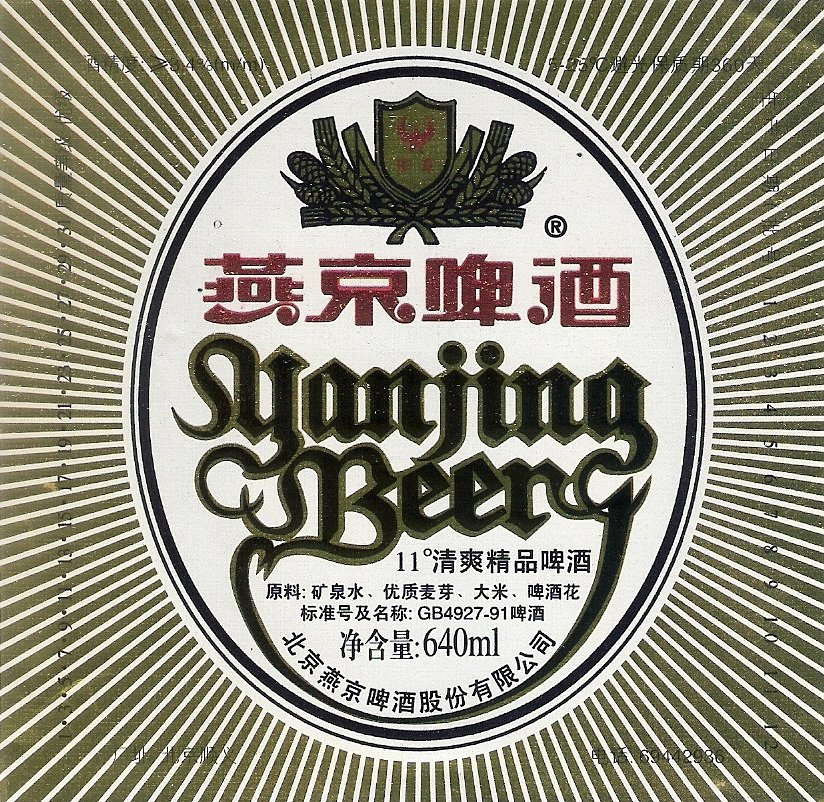
Yanjing Beer
This state-owned craft brewery was established in 1980 in Beijing, China, the company now produces a variety of beers, though, the signature brand, Yanjing Beer, as the official beer served at all state banquets, has been successfully marketed and received by the public as, ‘the real taste of China’.
The label face is oval in shape with a diffuse textured border on a white background creating a strong contrast base to build upon. The corporate logo features a golden shield with a red star over a red crescent supported by a bouquet of wheat, hops and grasses.
This logo and brewery name combine to create the brand name which occupies the upper portion of the label. The product name stands out primarily through contrast, as the bold gothic style font is complex and compressed and needs to be read, 90% the majority of its customers would read the Chinese characters above it, probably viewing the gothic text as more of a symbol. Organic curves are used to bring additional cohesion to the English language version of the product name.
Heineken Beer
Originally designed in 1883, 10 years after the establishment of the brewery, the Heineken label has undergone many iterations to become the well-recognized label we see today. In its original incarnation, the focus of the label was not on the Brand but rather on the specific beer product, Pilsner, Bavarian Lager, Münchner Bier or Dortmunder.
The design has maintained consistency over time and across products with its distinct oval shaped light green peripheral band, it’s now trademarked five-pointed star with a solid red fill. The Brand name in a bold white font is contrasted on a billowing Black banner straddling across the centre of the label dividing it into two, the upper portion identifying the product and the lower portion suggesting an additional experience of ‘Premium Quality’ and referencing some historical prizes.
Harbin Beer
Established in 1900 in Harbin, China, the company produced a variety of generic beers, catering to the tastes in Northeastern China. The label is grounded clearly front and centre with the Brand Name. A strong capitalized font transitioning through a cool fresh light-blue to a deep blue gradient suggesting a royal heritage and fresh flowing waters like the coming of spring, the periphery is strengthened by gold embossing and subtle lightening and shadowing effects, embodying permanence and structure.
The brand name is highlighted above and below by proportionally spaced and balanced horizontal bars bringing further structural strength to the brand. Above the brand name, the year of establishment appears in a gold script font, capped by an image of jagged snow-covered peaks.
The product name, in a strong raised traditional Chinese character font, sits balanced on a gold-rimmed plate, the deep blue backdrop flowing down from above. Two, raised, five-point stars bound the product name giving it an official nameplate appearance.
Brahma Chopp
Established in 1888 in Brazil, the company produced a variety of generic beers, until in 1914 it introduced Brahma Malzbier, a Malt beer, which rapidly became a national leader. In 1934 with the launch of Brahma Chopp, their future success was ensured as it became Brazil’s top-selling beer and an international success.
The label presents the Brand name, big and bold, front and centre, with a bold white capitalized font contrasted on a billowing Red banner straddling across the centre of the label, embracing the light coloured oval shape below. The actual product name is included almost as an afterthought with a casual script cleverly joining the Brand name to the cool refreshing beverage suggested in the lower portion of the label.
To complete the lower portion, two wheat sheaves sweep upwards from the bottom to indicate the pure essence of the beverage. The upper portion of the label contains a cartoon-like image of an overflowing frothy beer and a reference to its establishment way back in the depths of time.
Guinness
Established in 1759 the Guinness brewery in Dublin offered one product. Porter. A dark, almost black beer with a distinctive creamy froth on top. The cream coloured label, mounted on a vessel (originally in bottles and now in cans) with a background colour matching that of the beverage itself, conveys all of this information.
The brand, big and bold in the centre of the label, just below that, the red signature of Arthur Guinness conveyed a personal guarantee of satisfaction. Above the brand name, the emblem of Ireland, the Celtic harp, and the company logo grounded the product as being ‘Irish’ to a population living under an imperial foreign power.
The label is bounded by the product name and brewery name, though the addition of the word ‘ EXTRA’ in the product name suggested or hinted at a hidden bonus. This beer became so iconic in Ireland that one could simply order ‘two pints’ secure in the knowledge that you would receive two pints of Guinness stout.
That concludes our look at the label design of these nine best selling beers. As designers, both new and established, it’s useful to take a look back at the works of other designers and learn from them and how they create their work in a wide variety of fields.
Have you seen any beer label designs that you love or impressed you?
I’d be very grateful if you’d share this post. Thank you!
Get A Free Printable Photoshop Toolbar Cheatsheet
Subscribe now to get a free printable poster showing all of the Photoshop tools and their keyboard shortcut.
John Farley is a writer, yoga teacher and avid frisbee player based in Toronto, Canada.


